
Old-timers remember one of the most meme-worthy features of Microsoft Office from 1997 to 2003: the virtual assistant paperclip with eyes, also known as Clippy. Those who deal with fonts more than just the usual text in Word and Excel have probably heard that Comic Sans is considered by many to be the most hideous font in history, using it unironically is seen as a special level of cringe. Far fewer of our contemporaries remember that both Clippy and Comic Sans are legacies of one of the most epic failures in Microsoft's history and interface development in general. Let's recall how and why a project that seemed interesting and promising at the start failed and whether this failure was accidental or inevitable.
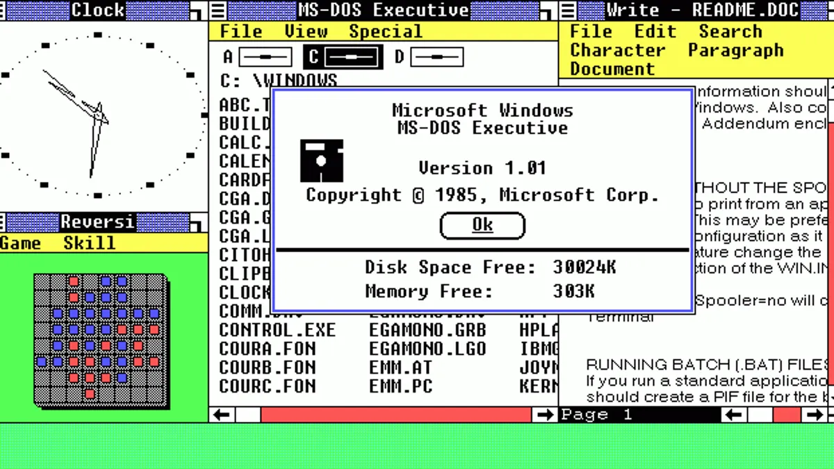
It was the distant year of 1991. Personal computers were spreading more and more in the USA, and an increasing number of their owners were not well-versed in programming. This is why Apple in 1984 and Microsoft in 1985 released the first commercial operating systems with graphical interfaces instead of command lines: Mac OS and Windows 1.0. However, these were still dark and obscure times for computer literacy. Today, even many rural grandmothers skillfully use smartphones, but back then, at the turn of the eighties and nineties, even quite advanced people often looked at the desktop with folders and a cursor arrow as if they were sheep seeing a new gate.
This caused some concern within large IT corporations that they were losing part of the potential market due to the excessive complexity of graphical interfaces for some novice users. While those who knew C++ mocked Windows and dreamed of apocalyptic retribution, within Microsoft, the idea of simplifying the graphical interface to complete intuitiveness was brewing. And to heavily spice it up with interactivity. So that even the dumbest user, like the goofy characters from '90s comedies, could handle learning to use computers.

The idea of a simple and intuitive graphical interface came to developers of Microsoft Publisher, Karen Fries and Barry Linnett. Karen Fries was not only an IT specialist: she joined Microsoft as an HR and advanced well up the career ladder thanks to her good soft skills, as we would say today. In other words, she knew how to make people like her and convince them of her correctness, and some of her leadership were literally people she had hired. Barry Linnett, in turn, was a specialist in creating educational programs. Thanks to Linnett and Fries, Microsoft Publisher, a program for preparing documents for printing—intended for media and publishing staff rather than professional computer users—included built-in wizard functionality. These wizards literally guided the not-so-experienced user to achieve the desired result through a set of standardized solutions.

Embedding a user assistance mechanism in Microsoft Publisher was considered a success, even appreciated by Bill Gates himself. Thanks to this, Fries and Linnett decided to propose a much more ambitious idea to the company's management: to create a fully graphical interface that mimics real-world objects and is complemented by an advanced virtual assistant. The combination of self-evidence of how everything works with abundant advice and help from the virtual assistant was supposed to make using the operating system shell accessible to anyone—even those for whom simple windows and files invoked sacred fear and the desire to call an exorcist. Moreover, Fries wrote, the complexity of Windows interfaces was rapidly increasing as it developed, and there was a risk that soon everything would become as complex for inexperienced citizens as "bare DOS" or at least Commander-like interfaces.
To promote and sell their concept to the management, the experienced HR and educational program specialist launched a whole campaign. They enlisted the help of one of Microsoft's leading developers, Darrin Massena, who helped them create demo versions of the proposed shell and animated assistants for it. As they worked on the demos, they conducted marketing research among company employees and their acquaintances to see if the idea was well-received. Focus groups seemed to go well: one participant was so impressed with the "talking" animated duck that he shook Fries' hand and demanded she "ditch all those boring manuals and give the duck that would always be on screen and tell him what to do." Fries justified the need for a virtual assistant by comparing it to a restaurant menu: it could have many confusingly named dishes, and you would need a waiter's help to explain what everything was.

As heavy artillery support, they reached out to Stanford scientists Clifford Nass and Byron Reeves, known at the time for their work on human-computer interaction. Nass and Reeves wrote a very scientific justification that the more intuitive and "human-like" the computer interface appeared, the better users would perceive it. Literally: according to their calculations based on a series of social experiments, the part of the brain responsible for using the mouse and keyboard also responded to emotional reactions when interacting with other people. Therefore, if people reacted to computers similarly to how they reacted to people, it would be reasonable to include something animated and interactive in the software. Both scientists would become consultants for the new project.

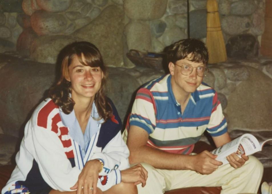
All this was eventually presented to Bill Gates, who approved the development of an even more graphical shell for Windows, which was then an overlay on DOS with a graphical environment: literally "we enhanced Windows so you could use a graphical interface to make the graphical interface easier to use." The marketing manager was made Melinda French, the chief manager of Microsoft’s information products and, during the project, Bill Gates' then-girlfriend and later wife. She also worked on Microsoft Publisher, understood what Fries and Linnett were aiming for, and was supposed to turn the idea into a well-selling product. Karen Fries directly managed the project. Initially, the team consisted of only three people, but then it grew to 12, and later to 35 employees.
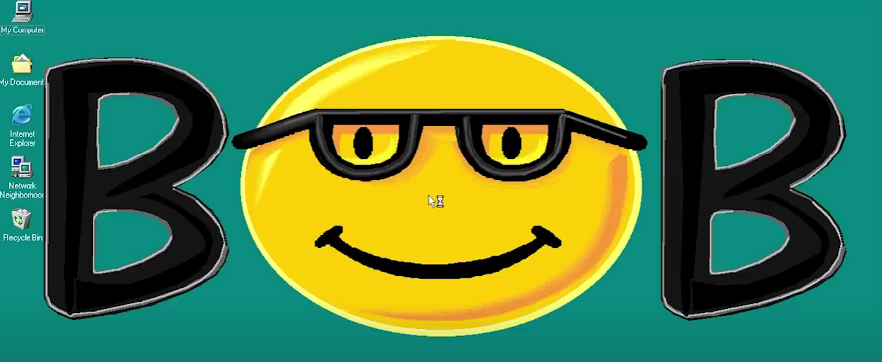
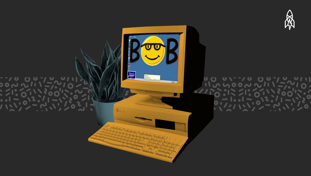
Initially, the future software product was called Microsoft Data Wizard, named after the mechanisms used in Publisher to ease work for inexperienced users. For most of the development period, the product was known internally as Microsoft Utopia: a very ambitious and somewhat boastful name. Only a couple of months before the release was the name changed to the strange and somewhat goofy Microsoft BOB, with a logo featuring a smiley face in glasses in place of the letter O, somewhat reminiscent of a young Bill Gates. This was not an acronym; the developers were just in a playful mood as the release approached. By this point, much had already been done, so in the file system, many files still contained the name Utopia.
On January 7, 1995, the program was presented at the international computer exhibition. The company placed high hopes on Microsoft Bob—in promotional articles, the new environment was promoted as, no less, the future of graphical operating system interfaces and their new standard. Bill Gates himself publicly stated that this was an important new evolutionary step in the development of graphical interfaces and that new, more powerful computers for the mass non-professional market would predominantly use such environments. Magazines reported "according to sources" that in focus groups, 84% preferred the Microsoft Bob interface over the standard Win 3.1. The most ardent Microsoft supporters even went as far as calling Microsoft Bob "the nail in Apple's coffin" unless they urgently started working on their equivalent.

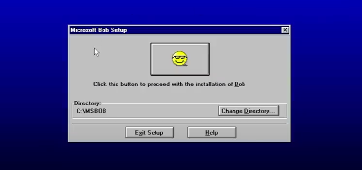
- The official release of Microsoft Bob as a graphical overlay for Windows 3.1 took place on March 10, 1995, although it only hit stores on March 31. The cost of a copy was $99, which, considering inflation, is a little over $200 today. The system requirements at the time of release immediately turned away many who wanted to try it. Not everyone had hardware capable of running it smoothly without freezes and crashes:
- Processor no lower than Intel 486SX;
- 8 MB of RAM (a significant amount for 1995 when 4 MB was considered solid);
- 32 MB of disk space;
- Super VGA video card displaying at least 256 shades;
- Floppy disk for installation and document work;
- Mouse;
- Modem with a bandwidth of 9.6 kilobits per second.
Immediately upon installation, the user was hit with a tsunami of various explanations, including clearly excessive ones: like reminders of the location of buttons on the keyboard. Worse, where advice was redundant in some places, the user had to literally figure out what the program expected from them in others. The "button moving department" phenomenon, as it was called during the heyday of World of Tanks, came into play. Instead of the classic Windows placement of the OK button in the lower right corner of the window, in Microsoft Bob, this spot had the Help button. The action confirmation was... by clicking a big button at the top with a smiling face in glasses, the product's logo. Of course, there was also a caption "click this button to continue," but it still looked strange.
The application environment graphically represented drawn, almost cartoonish rooms with objects. The main desktop was a living room with a small fireplace, a study, a garage with a convertible, a kitchen, a children's room, a safe's interior, and even... a mouse hole. Additional settings included a village hut with an angry mouse on the table and an owl in a bow tie, bewildered by everything happening.
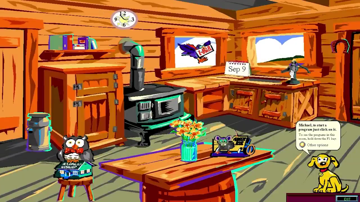
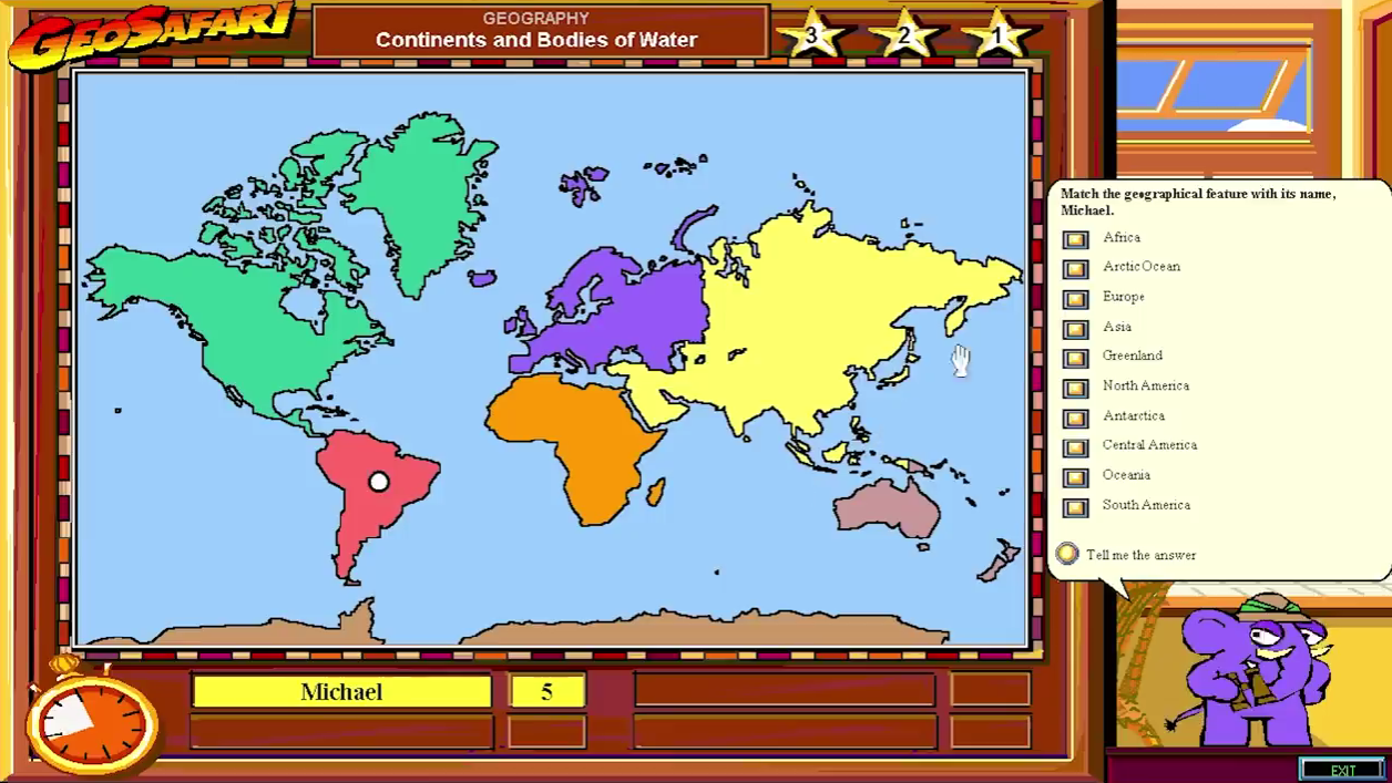
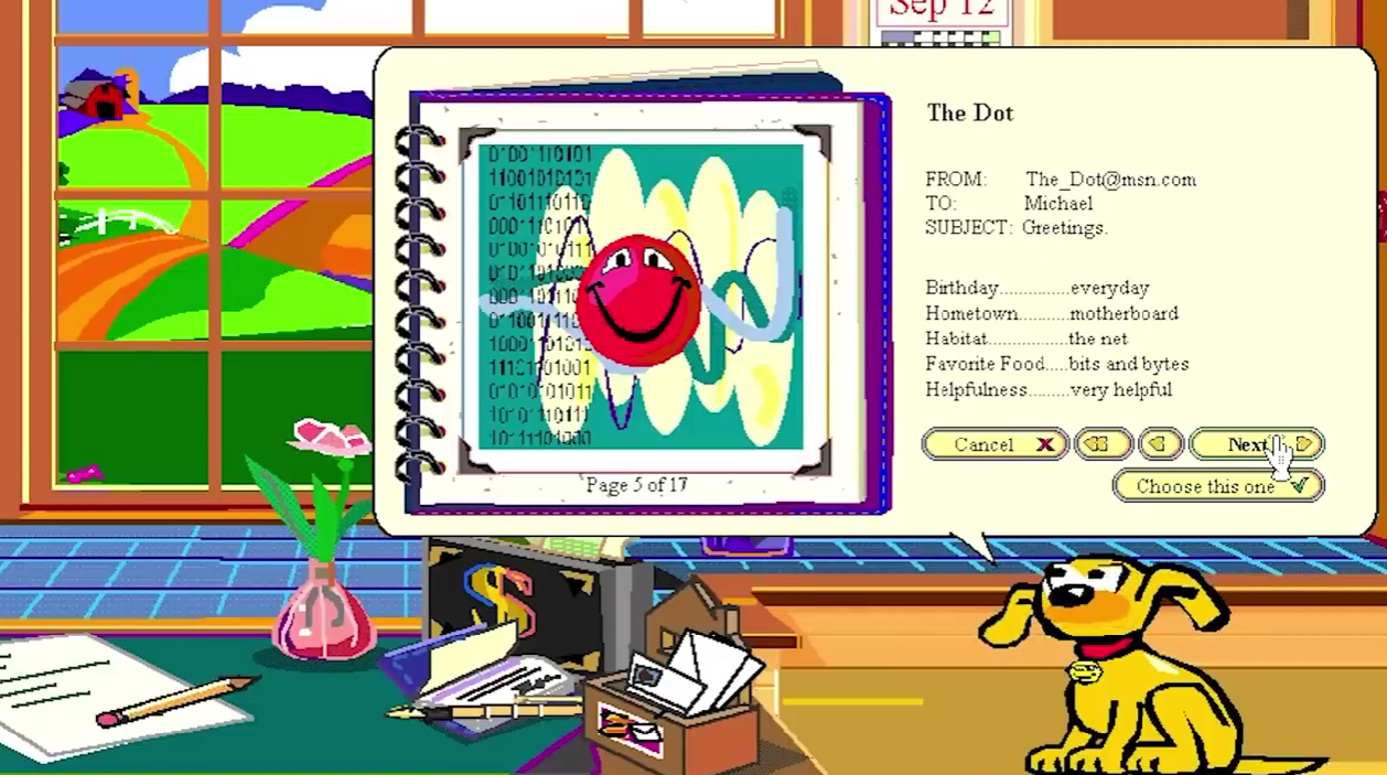
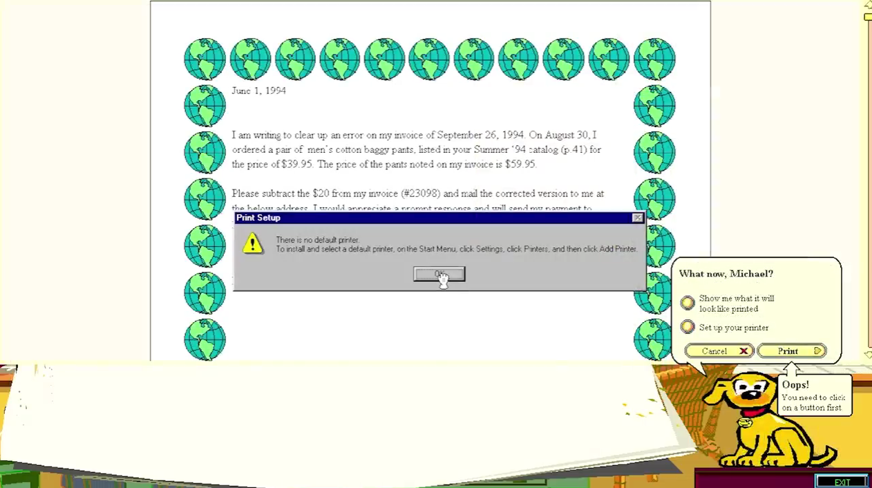
The main virtual assistant was a golden retriever named Rover: his phrases appeared in text comic bubbles on a beige background (this visualization of hints is the main legacy of the project that has survived to this day). There were other assistants to choose from, each more bizarre and demonic than the other, as if the authors were parodying themselves: a fluffy round cat Chaos, a gothic gargoyle Baudelaire, a fly Blythe, a strange black creature Chez with a trumpet nose, a red smiley face Dot with a burnt-out look, and a nervous blue hare Hopper, who foreshadowed the protagonist of "The Shop Around the Corner." Some applications had their unique virtual assistants. For example, a talking book Lexi in glasses helped with financial tables. In the geographical application with a world map, the assistant was the not-very-politically-correct elephant Hank in a colonial pith helmet.
All this looked... literally too childish. Reviewer John Dickinson wrote: "Unfortunately, both the room images and the assistants look like they came from kindergarten. They are drawn as if their target audience is children and teenagers under 12. This is completely unattractive for people looking to seriously use a computer for work and for adults in general." Ben Shneiderman added about virtual assistants: "It may look cute the first time, but the second time they seem silly, and by the third, they're just annoying and distracting."
And if it was only the appearance: the virtual assistants, which were supposed to give the environment a lively and almost human face, turned out to be primitive and dumb as a rock. Most user questions did not provide a clear answer but opened a form to contact Microsoft support: write, and maybe someone will respond when they have time. Worse, when a warning window with an acknowledgment button popped up, you could not close it! You had to click on the assistant first, and only then, with an idiotic grin, would they allow you to close the pop-up window.
The inconveniences didn't stop there. The only supported email format was a paid (!) mailbox service from MCI with an address bob.com, which was specially bought from a Boston IT guy named Bob Anti. To register, you had to call an operator at the number helpfully provided by the assistant. The application was reviewed within 10 working days, and the monthly mailbox fee was $5. For this amount, you had the full right to send 15 emails per month. Connecting other email accounts was not provided. Users were presumably overjoyed and dreamed of shaking the developers' hands... no, not their hands.

And only one innovation that could have made MS Bob perfect in its horror did not make it to release. In October 1994, Microsoft designer Vincent Connare, having reviewed the work, stated that the Times New Roman font used in hints and other text elements was too conservative for the overall style. He began working on a font more suitable for the screen's chaotic design—thus Comic Sans, considered by many to be the world's worst font, was born. The developers scratched their heads but decided to stick with Times New Roman. However, Comic Sans was still included in Windows releases and became "beloved" by everyone.

Even without the cherry on top in the form of Comic Sans, Microsoft Bob failed spectacularly amid scathing reviews in the press. Almost everyone criticized it. One of the harshest and most detailed reviews came from Stephen Manes of The New York Times:
Bob is a miserable assistant. It stores data in formats that few other programs can read. It stubbornly changes the position of the OK and Cancel buttons. Moreover, this Bob is idiotically inconsistent in keyboard shortcuts. Pressing Ctrl+L on the desktop adjusts the volume; the same in the address book will call up mailing lists. Again and again, Bob points out in pop-up windows what to do but doesn't let you do it until you press OK.

The failure was complete. Clumsy PR damage control attempts by Microsoft only added fuel to the fire. Soon after the release, the awkwardness of Microsoft Bob became a meme in the computer community, and even mentioning some successful developer findings became a risk to one's reputation. Only 58,000 copies of Microsoft Bob were sold compared to the millions of legal copies of Windows 3.1 and the upcoming Windows 95, which was released just a few months later. The project was closed in early 1996. Its most notable and meme-worthy legacy remained the virtual assistants in Microsoft Office from '97 to 2003, especially the famous Clippy.

Clippy also annoyed many, was deservedly considered pointless, and quietly disappeared—but over time became a nostalgic and even popular symbol of the late nineties and early 2000s. Comic Sans also survives to this day, often used in comics and elsewhere, causing aesthetes' eyes to bleed. And the beige hint bubbles in Microsoft products—they were also born as a sound idea in the overall failed Microsoft Bob. Overall, the project failed so spectacularly that even in the late 2000s, it was remembered as one of the most epic fails in IT history. Now, few remember it. But who knows, if its graphical part had been more beautiful and the technical part polished as it should have been, maybe the failure would have been at least not so loud and total.
In the end, the "windowed" graphical interfaces, laid down by early Mac OS and Windows, became the standard for computers. Further simplification turned out to be excessive and essentially unnecessary. It's even hard to imagine that once, even some specialists considered windows and drop-down menus too complex, and interfaces with desks and vases—the future of the virtual environment. Forecasting is a tricky business.