
Maps created by me using the mapchart.net application. Click on images to view/download a larger version.
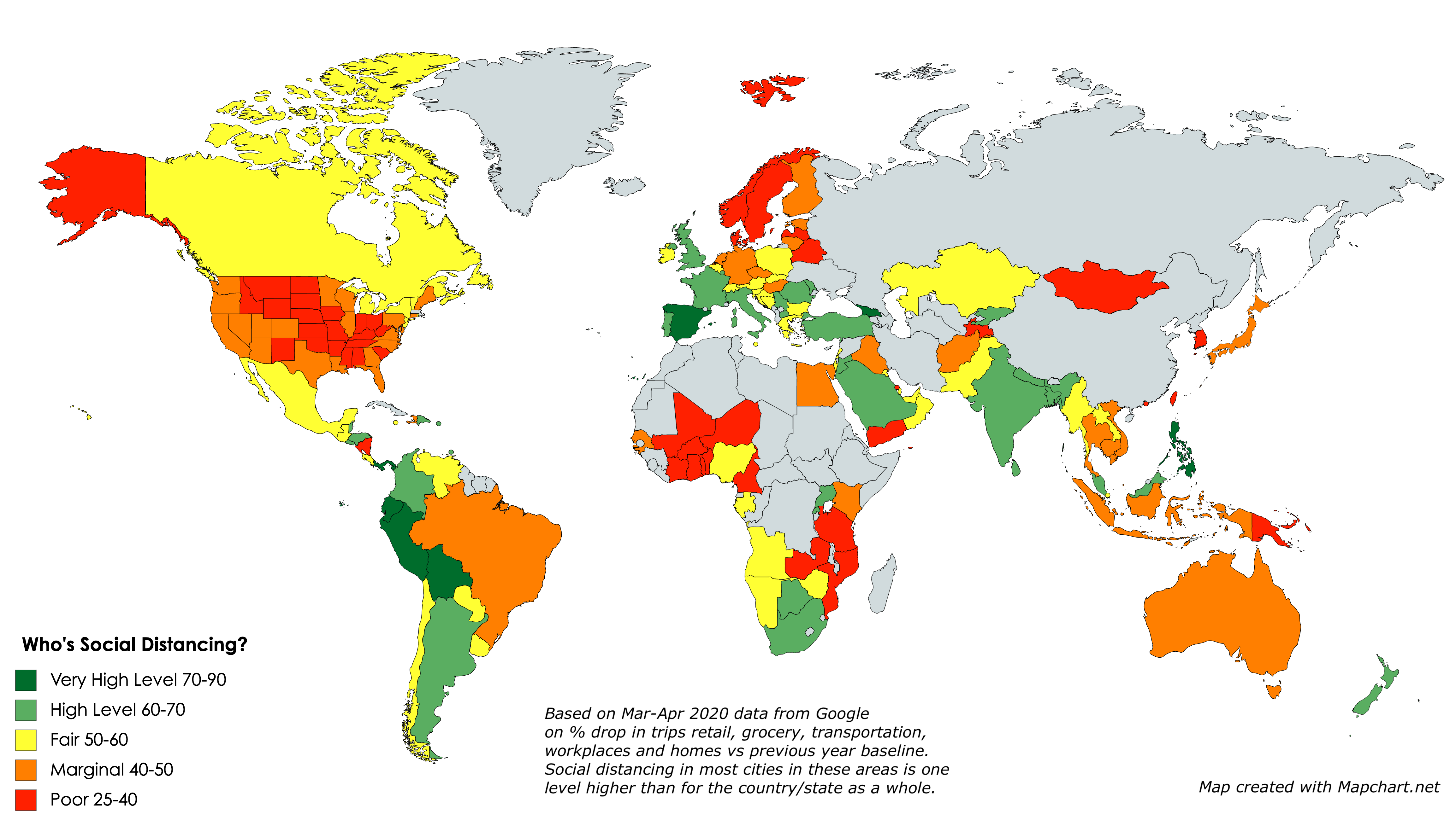
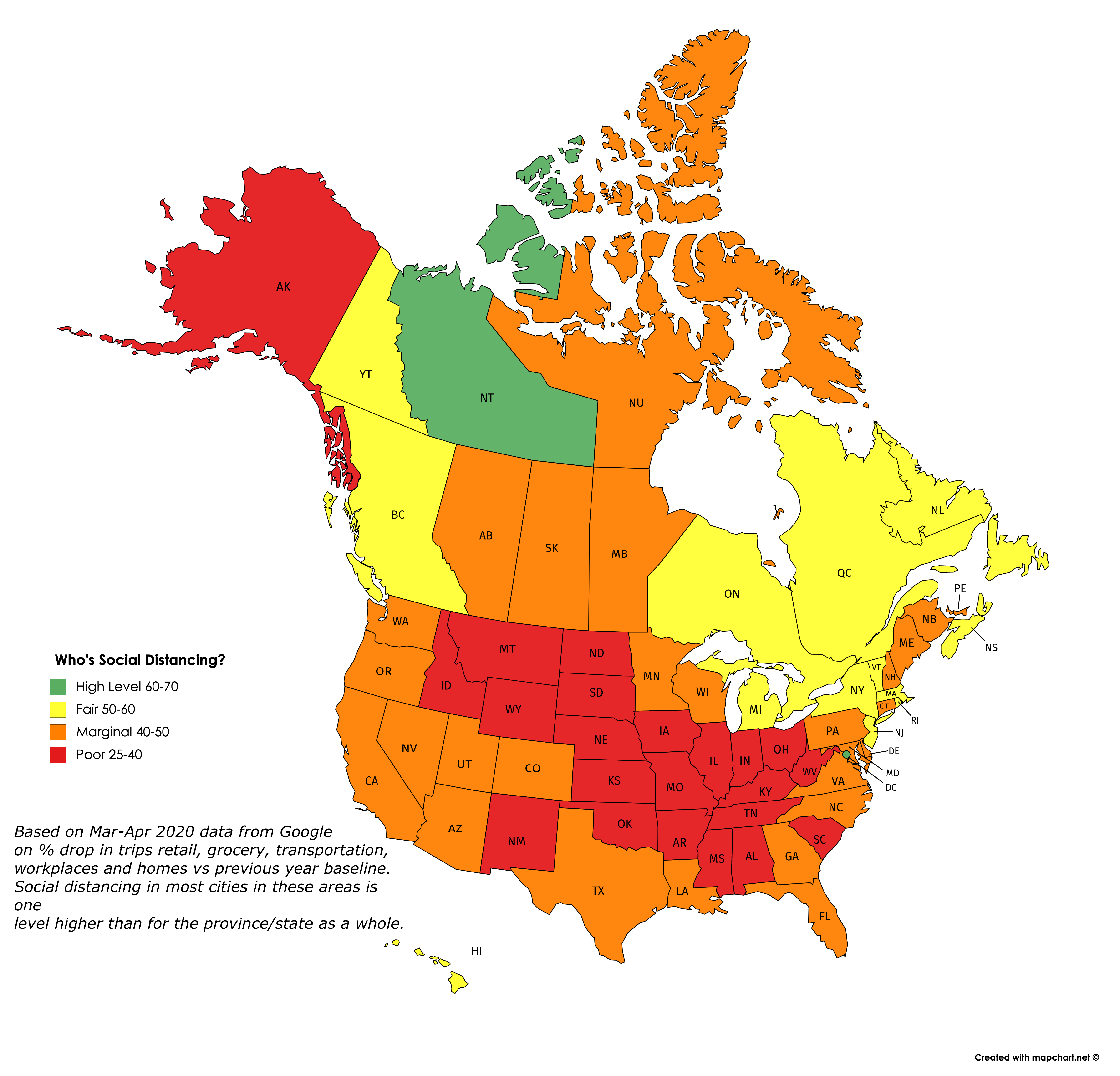
Google has just released a mass of downloadable data on how sharply visits to retail, grocery, transportation, workplaces and homes have dropped off in March and April, versus the baseline average for the same time periods in past years. I thought I would map it to show which countries, states and provinces are seemingly doing the most social distancing right now.
So this is what I did: I averaged the drops in these five categories over the past seven days, giving a lower weight to home visits than the other four categories. (Google also shows data for visits to parks, but I chose to exclude them.) I converted the averages into an index that shows roughly how large a % drop there has been in social activities in the last week of April, compared to a typical last week of April, the difference being due presumably to CoVid-19 restrictions.
What the maps tell me is not who’s conscientious and who’s not about social distancing, but rather how hard each area has been hit by the pandemic and how much they are therefore as a result willing to endure and sustain social distancing. So no blaming or shaming here: The fact that the Andean countries in South America have shut down so completely suggests (as the excess deaths data confirms) that everyone in these countries is aware of how many are dying all around them and hence how dangerous it is not to social distance. Likewise the low rates of compliance in the “red states” of the US reflects that they have not (at least yet) been hit in any highly visible way by the pandemic. The hardest-hit countries and states are, for the most part, continuing to do the most social distancing. And generally, they are the most densely-populated and mobile populaces. Each exception — such as California, Scandinavia, South Korea, Japan, Taiwan, Hong Kong, Australia and New Zealand — has a unique and important story to tell us.
Also worth noting is that cities tend to be one full category (10 points) higher in terms of their social distancing score than the rest of the country/state/province in which they’re located, probably for the same reasons. And for some tourist destinations, the drop in activity may be due as much or more to a decrease in visitors as it is to social distancing.
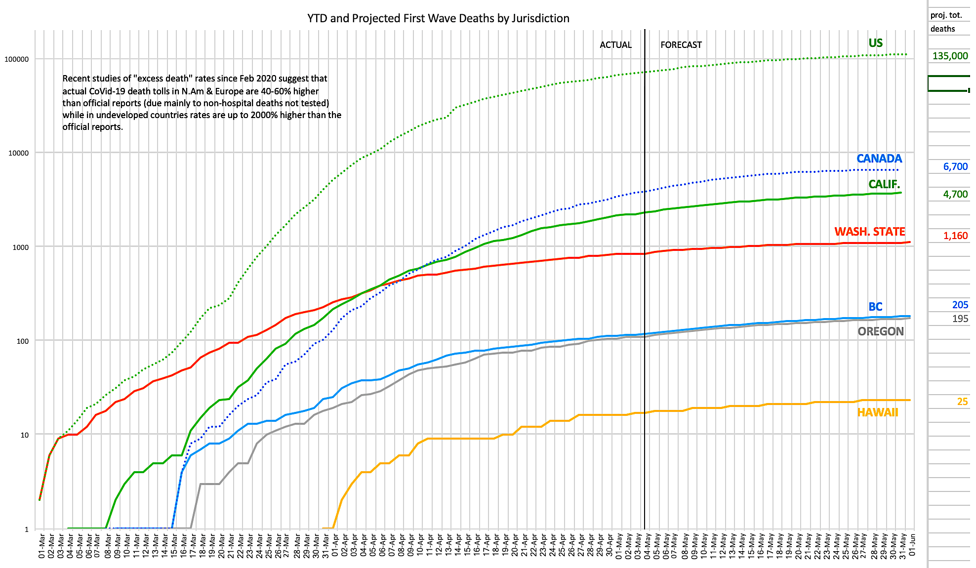
The chart above (click on it to view/download a larger version) [EDIT: Updated with new UW projections May 4th] shows daily reported and projected first wave CoVid-19 deaths for North America and West Coast states and provinces as at April 30, 2020. Data is from a variety of sources including the nCov Dashboard, Johns Hopkins, virusncov, wikipedia and local health departments and media reports. Projects are per the UW/IHME model downloadable data, adjusted when the forecasts for the past three days have been off by more than 30%.
The problems with these data are manifold:
- There’s often a long time lag between date of death and reporting the death in the daily reports — an average of 4 days in countries with well-developed reporting, and much longer in struggling nations.
- Some regimes are politically motivated to suppress data and find other explanations for deaths.
- The research on “excess deaths” (number of March/April 2020 deaths versus the average in the same months in recent years) in many jurisdictions suggests that, principally due to lack of testing capacity and the exclusion of many/most deaths outside of hospitals (even if the coroner’s report lists CoVid-19 as a probable cause), actual death rates attributable directly or indirectly to CoVid-19 are likely between 40-60% higher than reported in developed nations, and as much as 1500% higher than reported in struggling nations (in parts of Ecuador and Indonesia, for example, “excess deaths” are about 15 times the official CoVid-19 death totals, likely for the above reasons).
- It is impossible to ascertain how many “excess deaths” are attributable to very sick non-CoVid-19 patients’ inability or willingness to go to overburdened hospitals and therefore dying needlessly or prematurely of other causes at home.
- It is also impossible to ascertain how many accidental deaths have been prevented due to workplace shutdowns and less driving during the pandemic.
But taking all the above unknowns together, a best guess might be that instead of 250,000 deaths to date (the current official total), the actual toll is likely closer to a million deaths to date, and that (if the models pan out) the final real death toll will be between two and three million — and that’s just the first wave. Some European models suggest that over the next 2-3 years, as additional waves hit, some of which may occur simultaneously with the “normal” influenza annual peaks and hence create further hospital capacity crises, the total number of deaths from CoVid-19 could be several times larger again, before an effective vaccine is available.
It is also possible that contracting the virus does not confer immunity from reinfection or reactivation (reactivations are serious infectious flare-ups of the disease in people who had the disease but recovered and were no longer testing positive, until perhaps months or years later falling ill from it again or at least testing positive for it again). That would mean that the antibodies produced on initial infection might not be sufficient to protect the person from getting the disease again.
And that’s to say nothing of the risk of mutations, like the one that killed tens of millions of mostly young healthy people in the latter part of 1918, after the initial spring strain had killed only a few million mostly old people and the virus was considered under control.
It seems increasingly likely that the 0.2% first wave mortality rate I cited in my last article is closer to the true rate than the 1-3% mortality rate initially feared. [EDIT: May 14th: Now it appears the mortality rate is closer to 1.0%; see follow-up here.] If the actual first wave death total is, say 2.5 million, then that means 1.2 billion people (2.5 million/0.2%) will have been infected, or about 1/6 of the global population. Even if that 1/6 of the population does develop immunity from reinfection and reactivation (which is far from a sure bet), then the remaining 5/6 of the population will remain vulnerable to additional waves until and unless an effective, affordable, universally accessible vaccine is developed. This is far below “herd immunity” levels.
The actions that governments, health authorities and citizens would be best to do now were listed in my previous CoVid-19 posts.
EDIT May 2: We still don’t know how CoVid-19 kills us. (Great read about more of the uncertainties and mysteries of this virus; thanks to Tree Bressen for the link.) One of the ironies of this disease is that it’s been so hard to recognize because of the wide variety of symptoms that many (perhaps as much as 40% even in Europe and North America if the “excess deaths” studies pan out) of the people who have and will die from this disease had no idea they had it, and probably never will. That means that probably 100,000 Americans (not 66,000 as currently reported) and 5,000 Canadians (not 3,400 as currently reported) and a million people worldwide (not 250,000 as currently reported) have probably already died from the disease — and the only reason hospitals haven’t been overwhelmed as was feared if numbers got this large is that half of them never even tried to make it to the hospital (their symptoms didn’t match, or weren’t severe enough, or were masked by other pre-existing conditions). Something for the modellers, and the epidemiologists, to think about.


Its also possible that the analysis is partly the weakness of the measurement being made. For example – I live in semi-rural Australia, and we are doing a really good job of social distancing, as shown by the drop (new cases 10x each 14 days). But it shows as “orange” on google’s map. Maybe its orange, because unlike high density urban settings maybe we don’t make many trips to the stores, especially in rural areas, maybe we shopped once a week before, and still have to shop once a week now because unlike, for example New York, shopping means getting in our cars and driving, rather than going out the door and down the block so we don’t waste trips. I think there are a lot of other factors, where this map shows more the baseline differences in lifestyle, than any change (or lack of change) with Social Distancing.